Willow Street part two- the interior
There is a lot that a store needs to do to attract a customer in. The exterior lures them in, but what's going to make them want to explore the store some more? That's where the set up of the interior of a store comes into play. When checking out Willow street, I paid very close attention to the interior of the store. Here is what I found:
1. The overall atmosphere: The atmosphere is very warm, inviting and friendly. The sales consultants are easy to approach and are able to hold a conversation not just about apparel, but also current events. Customers trust the opinion of the sales consultants when asked for fashion advice. The downtown neighborhood is contemporary, so the modern look of Willow St coordinates with the town.
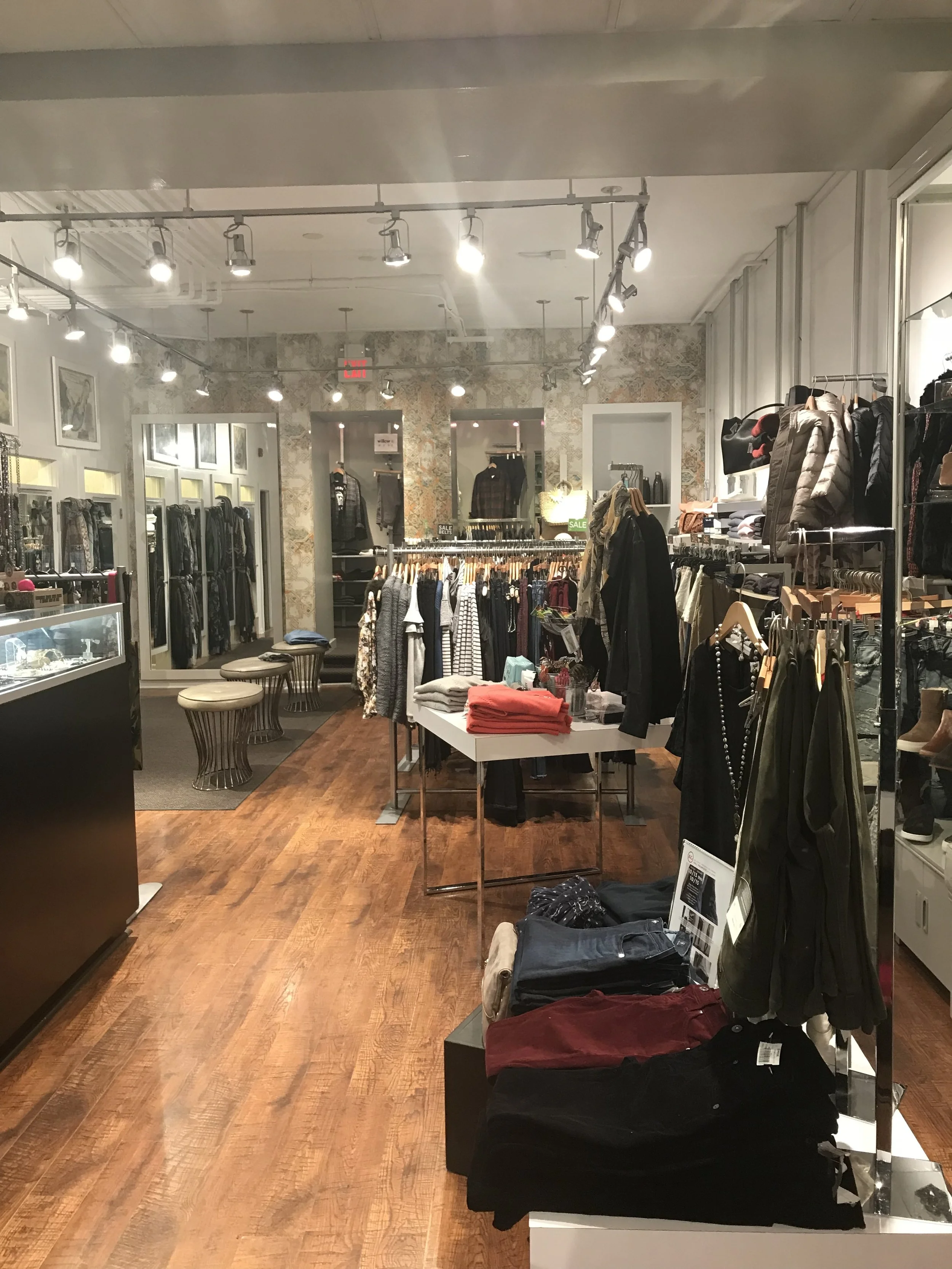
2. Colors: The store is mostly all white, keeping the attention on the clothes, so it is not too overwhelming. In the back, they have a floral printed wall next to the mirrors. This adds a little detail to the area since there is not much going on. The floor is all wood, with the occasional carpet. The wooden floor goes with the modern theme that they aspire to hold.
3. Texture: The texture of the store is rather flat due to all the merchandise. Framing the front window is an outline of neutral taupe stone. Throughout the store the walls are a flat white color paint with matte silver pipe floor-to-ceiling for the fixtures. The wood plank floor adds warmth with a mid-tone brown. There is also a neutral floral print wallpaper lining the rear wall of the store.
4. lighting: The front of the store receives a fair amount of natural light from the floor-to-ceiling window. The remainder of the interior has silver track lighting with spot lights using soft florescent bulbs. The dressing rooms are lit with overhead florescent lighting in a drop ceiling. There are spotlights directed at the store signage and the jewelry cases are lit for product detail attention.
5. Music: The music is mellow, coffee house style with artists like John Mayer, Maroon 5, and Adele. The volume is low for background effect so you can still have a conversation with the sales consultants. This music played in the store sets the mood for when the customers arrive. When a customer recognizes a song, it adds to their overall experience in the store.
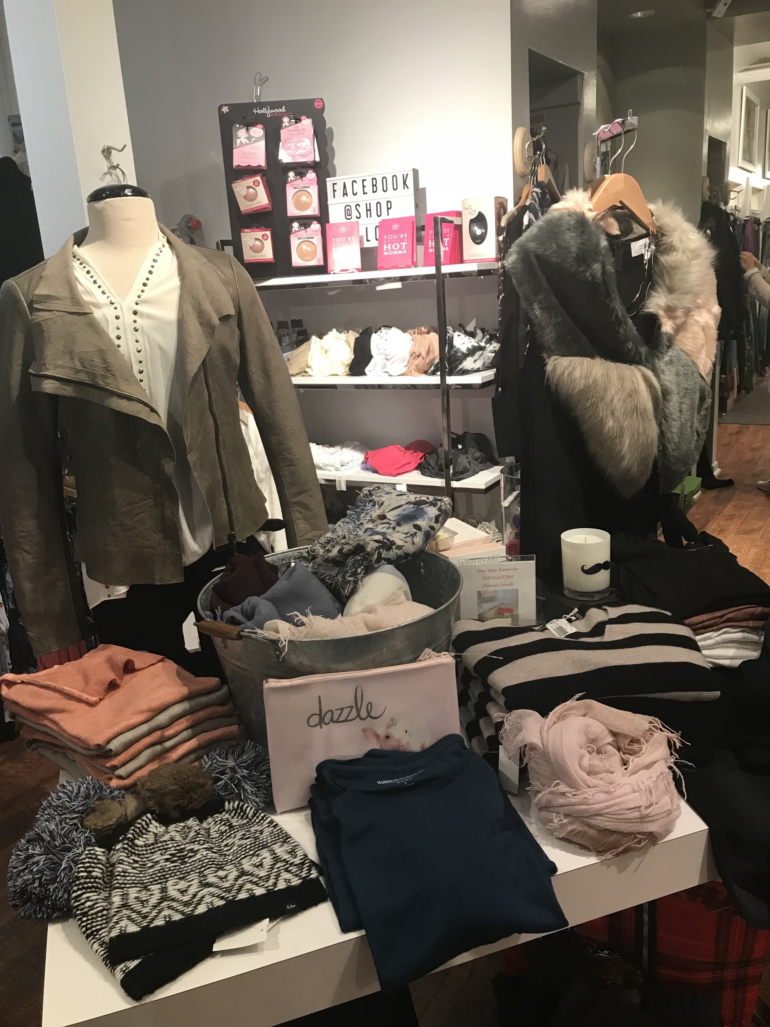
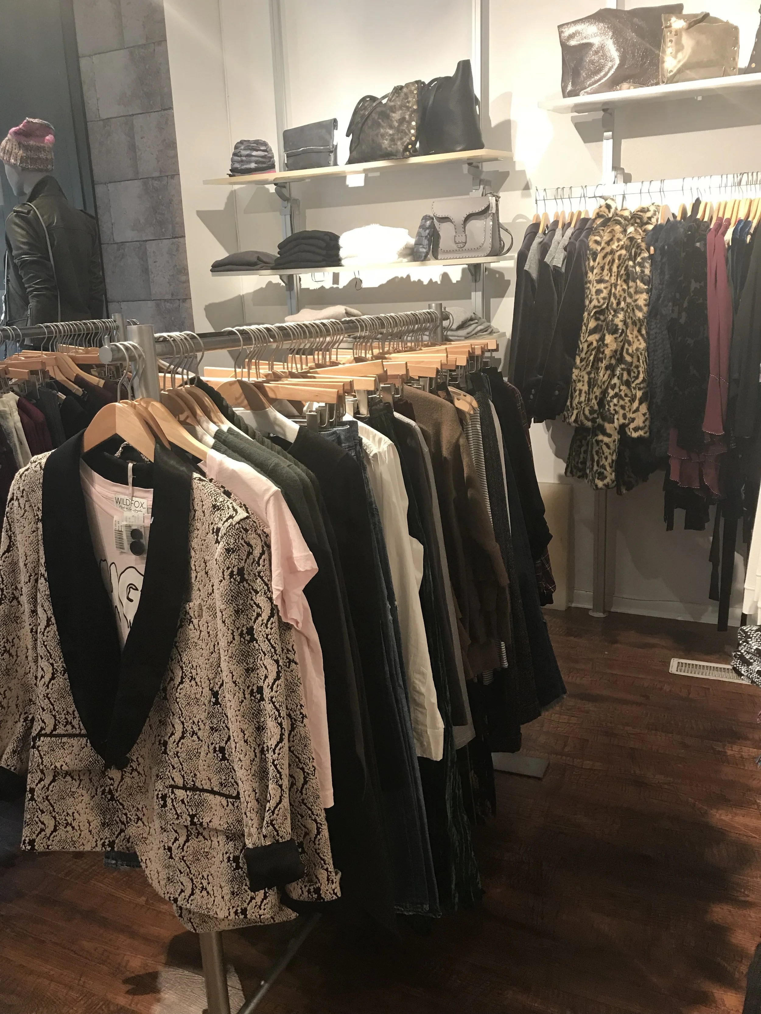
6. Main fixture types: There are a variety of mixtures in Willow St adding visual layers. There are the high fixtures along the wall with shelves and rods. The interior of the store uses six foot rods, similar to rolling racks, as well as white tables. There are several jewelry cases at the check out. The high floor to ceiling bookcases display the shoes and small accessories.
7. Elements of visual display: Willow St mixes the visual display with full mannequins in the store window and half mannequins inside the store. These mannequins are used to show the customer how to style an outfit. The silk flowers are bordering the "Willow Street" signage at the check out. The jewelry cases are lined with small rocks.
8. The customers journey: As the customer walks down the sidewalk they initially see the best outfits in the store window. Upon entering the store they see the latest arrivals include mens shirts which are in the back of the store. The sales consultants have a warm greeting for customers and even offer refreshments. Towards the rear of the store there is a sale section prior to the mens area.
9. Points of sales: Due to the size of Willow St there is only one point of sale, which is in the middle of the store. It is a combination jewelry case and wrap desk. There is one cash register with storage for tissue paper and bags underneath the wrap desk. Behind is a counter and hooks for product holds and returns.


